Monster Teaser League
Monster Teaser League
Monster Teaser League


Timeline
Timeline
Timeline
March 2024- June 2024 (12-weeks)
March 2024- June 2024 (12-weeks)
March 2024- June 2024 (12-weeks)
My Role
My Role
My Role
UX Project Lead - Project Management, User Research, Information Architecture, Prototyping, Usability Testing, Mobile-First Design
UX Project Lead - Project Management, User Research, Information Architecture, Prototyping, Usability Testing, Mobile-First Design
UX Project Lead - Project Management, User Research, Information Architecture, Prototyping, Usability Testing, Mobile-First Design
Team
Team
Team
Two UX Designers, Two UX Researches, One Developer, Two Key Stakeholders
Two UX Designers, Two UX Researches, One Developer, Two Key Stakeholders
Two UX Designers, Two UX Researches, One Developer, Two Key Stakeholders
Kickoff: Project Introduction
Kickoff: Project Introduction
Kickoff: Project Introduction
When Monster Teaser League (MTL) approached us, their innovative sports pick 'em site was at a crossroads. With 1,500 users and dreams of exponential growth, they knew their platform needed a major league upgrade. As I assembled our all-star team of two UX designers and two UX researches, I could feel the excitement - and pressure - building. We had 12 weeks to transform MTL from a rookie player to a championship contender in the pick 'em sports world. Armed with our UX playbook and a roster of digital tools, we dove headfirst into the challenge. Little did we know, this project would test our skills, push our creativity, and ultimately change the game for MTL and its users.
When Monster Teaser League (MTL) approached us, their innovative sports pick 'em site was at a crossroads. With 1,500 users and dreams of exponential growth, they knew their platform needed a major league upgrade. As I assembled our all-star team of two UX designers and two UX researches, I could feel the excitement - and pressure - building. We had 12 weeks to transform MTL from a rookie player to a championship contender in the pick 'em sports world. Armed with our UX playbook and a roster of digital tools, we dove headfirst into the challenge. Little did we know, this project would test our skills, push our creativity, and ultimately change the game for MTL and its users.
When Monster Teaser League (MTL) approached us, their innovative sports pick 'em site was at a crossroads. With 1,500 users and dreams of exponential growth, they knew their platform needed a major league upgrade. As I assembled our all-star team of two UX designers and two UX researches, I could feel the excitement - and pressure - building. We had 12 weeks to transform MTL from a rookie player to a championship contender in the pick 'em sports world. Armed with our UX playbook and a roster of digital tools, we dove headfirst into the challenge. Little did we know, this project would test our skills, push our creativity, and ultimately change the game for MTL and its users.
Scouting Report: Understanding the Challenge
Scouting Report: Understanding the Challenge
Scouting Report: Understanding the Challenge
As we huddled with the MTL team, the game plan became clear. Monster Teaser League had created an innovative sports league platform, a fresh take on the traditional pick 'em format for football and basketball. But despite its novel approach, MTL was fumbling at the goal line. New users were getting lost in the playbook, and even seasoned veterans were struggling to navigate the field.
Our challenge was three-fold, each aspect crucial for MTL's growth strategy:
Learnability
Learnability
Learnability
MTL's unique gameplay was their secret weapon, but also their Achilles' heel. The game's complexity was stifling growth, so how might we create a quick, engaging tutorial that could quickly educate and hook our users?
MTL's unique gameplay was their secret weapon, but also their Achilles' heel. The game's complexity was stifling growth, so how might we create a quick, engaging tutorial that could quickly educate and hook our users?
MTL's unique gameplay was their secret weapon, but also their Achilles' heel. The game's complexity was stifling growth, so how might we create a quick, engaging tutorial that could quickly educate and hook our users?
Commisioners
Commisioners
Commisioners
MTL's commissioner tools were overcomplicated, hindering league growth. How might we simplify these tools, transforming the Commissioner's Corner into an intuitive command center that empowered leaders to focus on running engaging leagues?
MTL's commissioner tools were overcomplicated, hindering league growth. How might we simplify these tools, transforming the Commissioner's Corner into an intuitive command center that empowered leaders to focus on running engaging leagues?
MTL's commissioner tools were overcomplicated, hindering league growth. How might we simplify these tools, transforming the Commissioner's Corner into an intuitive command center that empowered leaders to focus on running engaging leagues?
User Interface
User Interface
User Interface
MTL's current app was a maze of navigation issues, desperately needing a modern makeover to compete in the big leagues of pick ‘em sports. How might present this brand with an intuitive, cutting-edge user experience.?
MTL's current app was a maze of navigation issues, desperately needing a modern makeover to compete in the big leagues of pick ‘em sports. How might present this brand with an intuitive, cutting-edge user experience.?
MTL's current app was a maze of navigation issues, desperately needing a modern makeover to compete in the big leagues of pick ‘em sports. How might present this brand with an intuitive, cutting-edge user experience.?
The Playbook: Our Gameplan
The Playbook: Our Gameplan
The Playbook: Our Gameplan
Preparing to tackle MTL's challenges, we knew we needed a solid strategy. Like a coach planning for the big game, we turned to our trusted Double Diamond approach to structure our game plan. This framework would allow us to dive deep into understanding current MTL users while keeping our main objectives in clear view.
Our first play was a comprehensive research plan. We broke it down into four key plays:
Heuristics Analysis
Heuristics Analysis
Heuristics Analysis
We meticulously examined the existing platform, scrutinizing every element to identify usability issues. This detective work uncovered critical pain points in the user journey, from confusing navigation to unclear calls-to-action.
We meticulously examined the existing platform, scrutinizing every element to identify usability issues. This detective work uncovered critical pain points in the user journey, from confusing navigation to unclear calls-to-action.
We meticulously examined the existing platform, scrutinizing every element to identify usability issues. This detective work uncovered critical pain points in the user journey, from confusing navigation to unclear calls-to-action.
Competitive Evaluation
Competitive Evaluation
Competitive Evaluation
We didn’t just focus on our own game: How were other’s in this space operating? We analyzed competitors to learn from their successes and failures. This benchmarking revealed industry best practices and potential areas for innovation.
We didn’t just focus on our own game: How were other’s in this space operating? We analyzed competitors to learn from their successes and failures. This benchmarking revealed industry best practices and potential areas for innovation.
We didn’t just focus on our own game: How were other’s in this space operating? We analyzed competitors to learn from their successes and failures. This benchmarking revealed industry best practices and potential areas for innovation.
User Interviews
User Interviews
User Interviews
We conducted in-depth interviews with commissioners and players, getting the play-by-play of their MTL experiences. These conversations uncovered valuable insights into user frustrations, desires, and behaviors that data analysis alone couldn't reveal.
We conducted in-depth interviews with commissioners and players, getting the play-by-play of their MTL experiences. These conversations uncovered valuable insights into user frustrations, desires, and behaviors that data analysis alone couldn't reveal.
We conducted in-depth interviews with commissioners and players, getting the play-by-play of their MTL experiences. These conversations uncovered valuable insights into user frustrations, desires, and behaviors that data analysis alone couldn't reveal.
Affinity Mapping
Affinity Mapping
Affinity Mapping
We synthesized our findings through affinity mapping, piecing together insights like game footage. This process revealed key patterns and priorities, forming a clear game plan for our redesign.
We synthesized our findings through affinity mapping, piecing together insights like game footage. This process revealed key patterns and priorities, forming a clear game plan for our redesign.
We synthesized our findings through affinity mapping, piecing together insights like game footage. This process revealed key patterns and priorities, forming a clear game plan for our redesign.
Film Study: Reserch Deep Dive
Film Study: Reserch Deep Dive
Film Study: Reserch Deep Dive
Our deep dive into user research revealed a treasure trove of insights, giving us a clear picture of what MTL users really needed. Like a coach studying game tapes, we pored over our findings, identifying key plays that would make or break our redesign.
We knew MTL had two distinct user types: players and commissioners (who also doubled as players). To get the full picture, we conducted in-depth interviews with five players and five commissioners. This approach allowed us to address the unique needs and pain points of each user type. The insights we gathered aligned closely with our initial goals, confirming we were on the right track.
Navigation & Learnability
Navigation & Learnability
Navigation & Learnability
Our users were fumbling with the interface. They found it cluttered and unintuitive, like trying to read a complex playbook in the middle of a game. One user's comment struck a chord: "Eventually I just stopped telling friends because it's annoying to do so."
This highlighted a critical issue - if users couldn't explain the game, how could MTL grow?
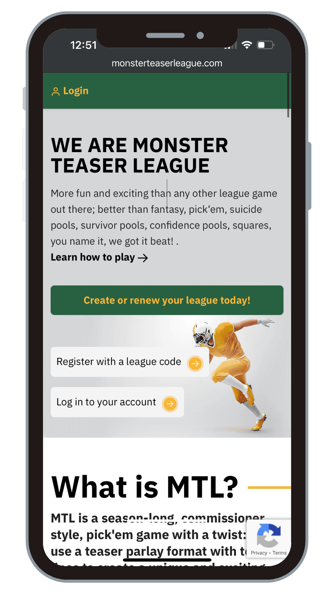

Sign-Up Stumble
Sign-Up Stumble
Sign-Up Stumble
Both commissioners and players were tripping at the starting line. The sign-up process was tedious for commissioners and confusing for new players - not the warm welcome MTL needed to grow its user base.
Both commissioners and players were tripping at the starting line. The sign-up process was tedious for commissioners and confusing for new players - not the warm welcome MTL needed to grow its user base.
Both commissioners and players were tripping at the starting line. The sign-up process was tedious for commissioners and confusing for new players - not the warm welcome MTL needed to grow its user base.
Commissioner's Corner Conundrum
Commissioner's Corner Conundrum
Commissioner's Corner Conundrum
The "Commissioner's Corner" was supposed to be the command center, but it was more like a rarely-used locker room. Commissioners only used this section at the season's start to invite players and at the end for final standings. While league communication was valued, the current format was as cumbersome as a rusty megaphone. Perhaps most tellingly, the Commissioner's Corner felt out of place - "it almost feels as if you are using a different app altogether."
The "Commissioner's Corner" was supposed to be the command center, but it was more like a rarely-used locker room. Commissioners only used this section at the season's start to invite players and at the end for final standings. While league communication was valued, the current format was as cumbersome as a rusty megaphone. Perhaps most tellingly, the Commissioner's Corner felt out of place - "it almost feels as if you are using a different app altogether."
The "Commissioner's Corner" was supposed to be the command center, but it was more like a rarely-used locker room. Commissioners only used this section at the season's start to invite players and at the end for final standings. While league communication was valued, the current format was as cumbersome as a rusty megaphone. Perhaps most tellingly, the Commissioner's Corner felt out of place - "it almost feels as if you are using a different app altogether."
Mobile Moves
Mobile Moves
Mobile Moves
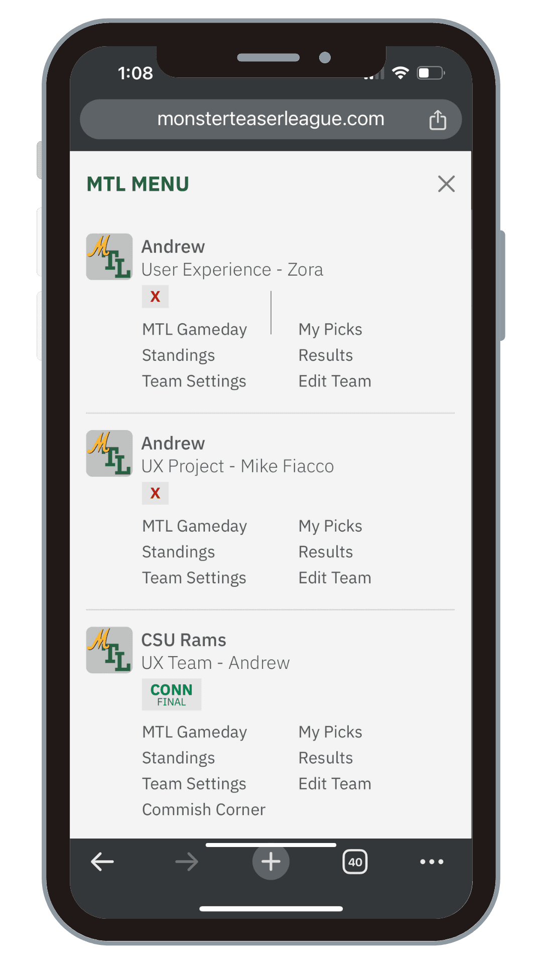
In today's on-the-go world, mobile optimization wasn't just a nice-to-have; it was crucial for keeping users in the game. Our research showed that users wanted to check their picks and league standings anytime, anywhere and be able to easily manage their teams and leagues from their mobile device.
In today's on-the-go world, mobile optimization wasn't just a nice-to-have; it was crucial for keeping users in the game. Our research showed that users wanted to check their picks and league standings anytime, anywhere and be able to easily manage their teams and leagues from their mobile device.
In today's on-the-go world, mobile optimization wasn't just a nice-to-have; it was crucial for keeping users in the game. Our research showed that users wanted to check their picks and league standings anytime, anywhere and be able to easily manage their teams and leagues from their mobile device.
Training Camp: Learnability Testing
Training Camp: Learnability Testing
Training Camp: Learnability Testing
To tackle MTL's learnability challenge head-on, we needed hard data. We invited 10 MTL newbies to explore the app and explain the game in their own words. Our metrics were simple but crucial:
To tackle MTL's learnability challenge head-on, we needed hard data. We invited 10 MTL newbies to explore the app and explain the game in their own words. Our metrics were simple but crucial:
To tackle MTL's learnability challenge head-on, we needed hard data. We invited 10 MTL newbies to explore the app and explain the game in their own words. Our metrics were simple but crucial:
Time on Task
Time on Task
Time on Task
3m 19s
3m 19s
3m 19s
How long it took users to grasp the game using the current tutorial.
How long it took users to grasp the game using the current tutorial.
How long it took users to grasp the game using the current tutorial.
Pass or Fail
Pass or Fail
Pass or Fail
40%
40%
40%
Only 40% of users could explain the rules effectively without error.
Only 40% of users could explain the rules effectively without error.
Only 40% of users could explain the rules effectively without error.
Ease of Learnability
Ease of Learnability
Ease of Learnability
2.4/5
2.4/5
2.4/5
On a scale of 1-5, how easy was it to learn how to play the game?
On a scale of 1-5, how easy was it to learn how to play the game?
On a scale of 1-5, how easy was it to learn how to play the game?
These numbers confirmed our suspicions - MTL's unique gameplay was a tough nut to crack for newcomers.
These numbers confirmed our suspicions - MTL's unique gameplay was a tough nut to crack for newcomers.
These numbers confirmed our suspicions - MTL's unique gameplay was a tough nut to crack for newcomers.
Mapping the Field: Information Architecture Analysis
Mapping the Field: Information Architecture Analysis
Mapping the Field: Information Architecture Analysis
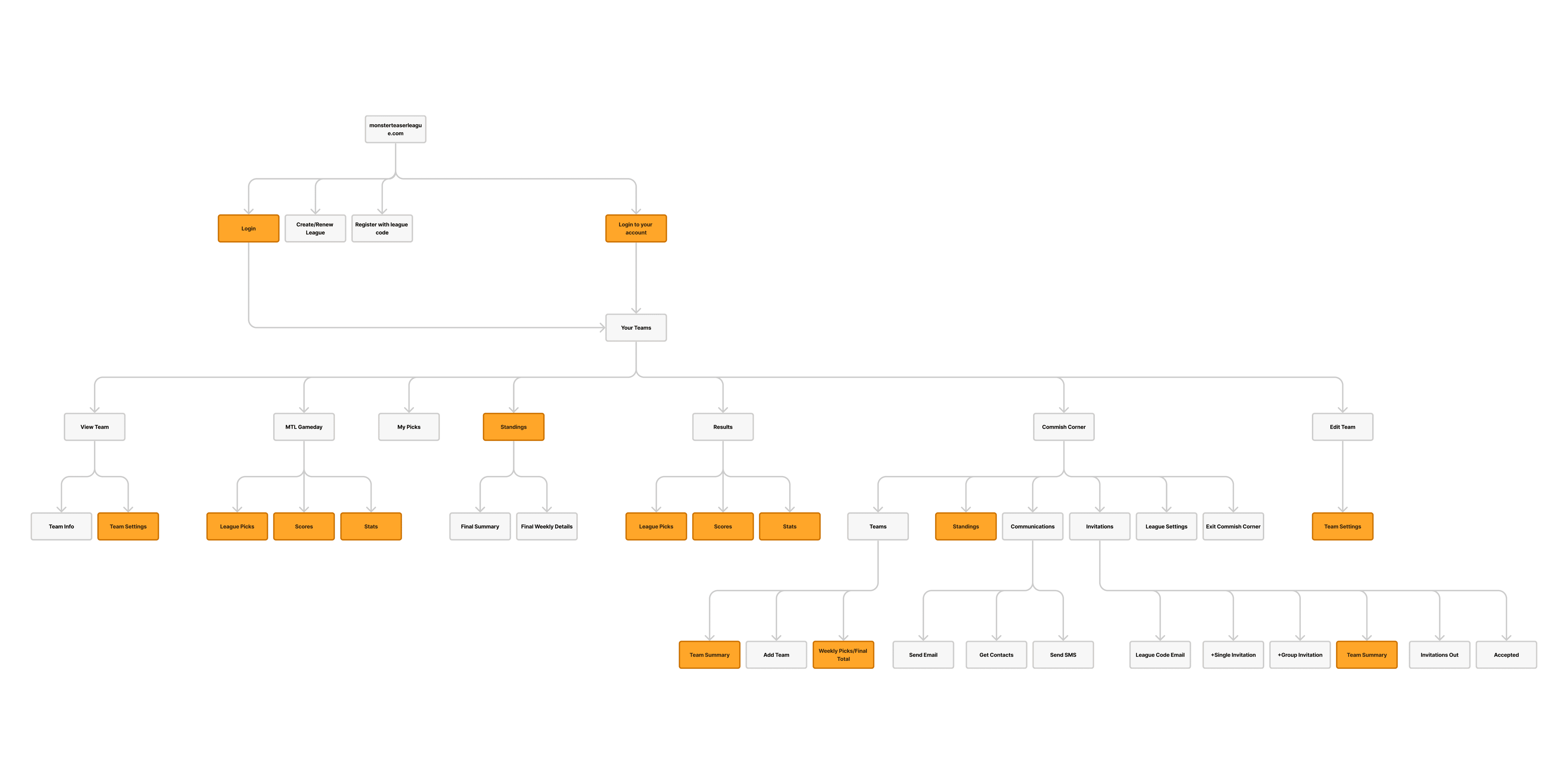
Next, we put on our detective hats and dissected MTL's information architecture. What we found was a tangled web of overlapping information and disjointed page flows. It was like trying to navigate a maze blindfolded - no wonder users were getting lost!
We created a visual map of the current structure, highlighting areas of redundancy. This bird's-eye view made it clear that a major reorganization was in order.

Drawing Up New Plays: Restructured Information Architecture
Drawing Up New Plays: Restructured Information Architecture
Drawing Up New Plays: Restructured Information Architecture
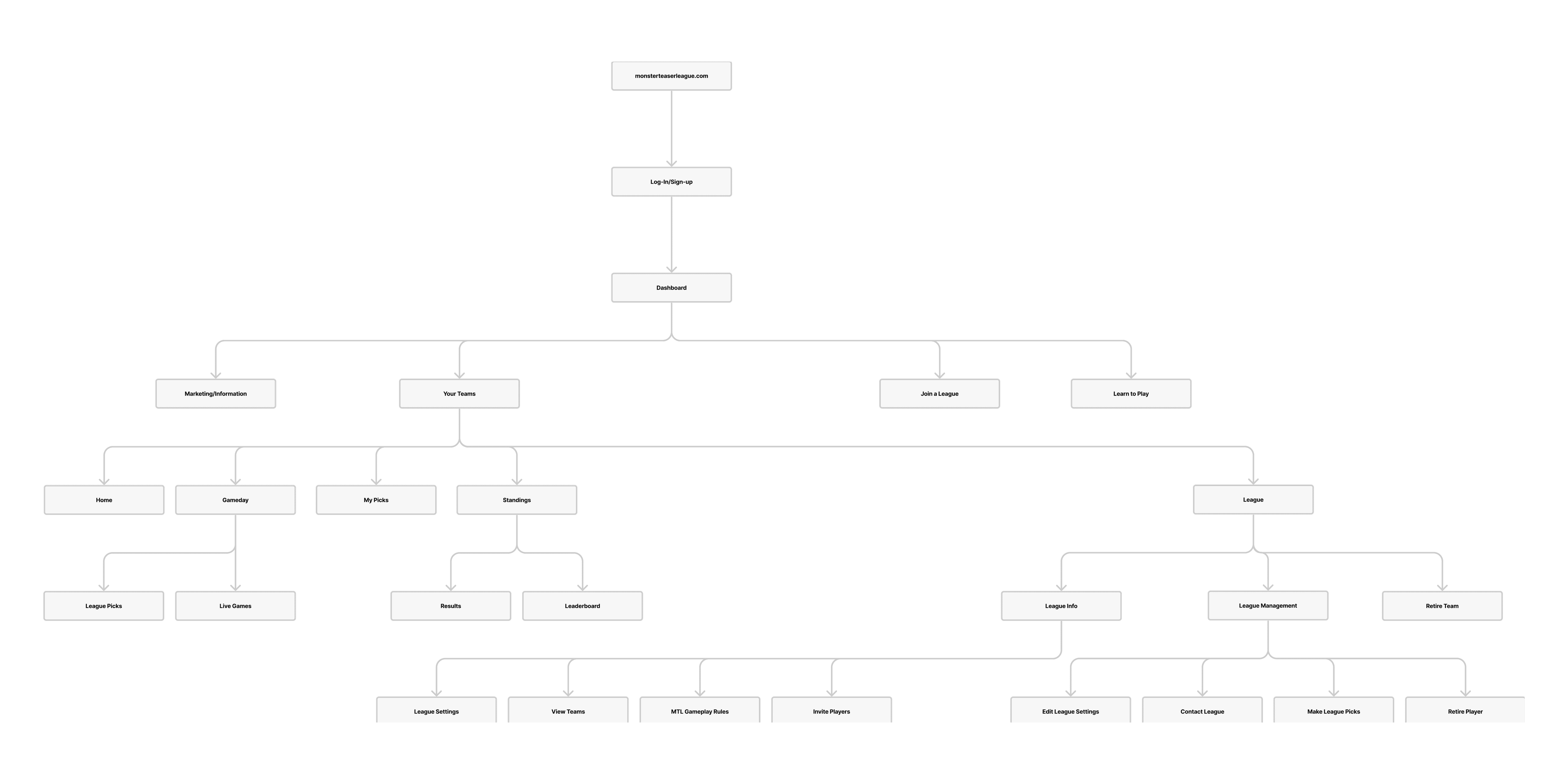
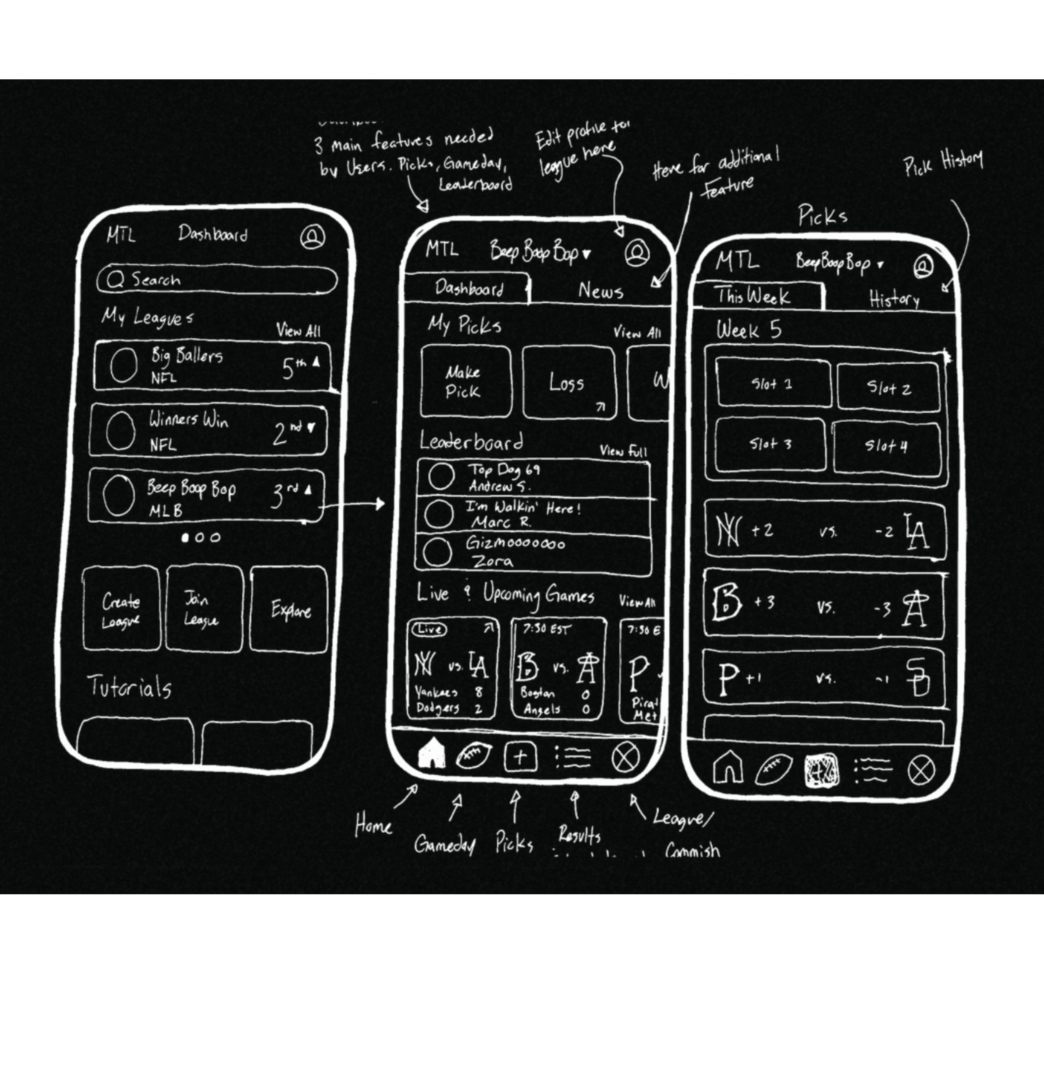
After identifying the issues with the current structure, our first challenge was to reorganize the information architecture. We created a global navigation system with five main pages: Home, Game Day, Make Picks, Results League Info
This reorganization was designed to make the interface more structured and visually appealing. By consolidating information and creating a logical flow between pages, we aimed to address the navigation issues that users had reported.
This new structure aligns with cognitive psychology's 'magic number' principle, which suggests that humans can effectively process 7±2 items at once. We also adhered to the 'three-click rule', ensuring users can access any information within three clicks - a standard praised by usability experts.
By simplifying the information architecture, we aimed to create a more intuitive user experience, reducing cognitive load and making it easier for both new and experienced users to navigate the platform.

Game Strategy: Feature Priorities
Game Strategy: Feature Priorities
Game Strategy: Feature Priorities
Armed with insights from our user and commissioner interviews, we took a hard look at features. Our mantra became "less is more." We categorized features into four buckets:
Armed with insights from our user and commissioner interviews, we took a hard look at features. Our mantra became "less is more." We categorized features into four buckets:
Armed with insights from our user and commissioner interviews, we took a hard look at features. Our mantra became "less is more." We categorized features into four buckets:
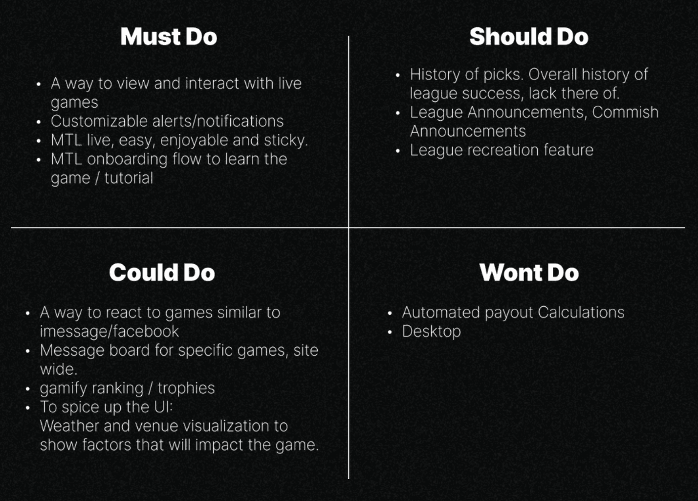

This prioritization helped us focus our efforts on the features that would deliver the most value to users while keeping the app streamlined and user-friendly.
This prioritization helped us focus our efforts on the features that would deliver the most value to users while keeping the app streamlined and user-friendly.
This prioritization helped us focus our efforts on the features that would deliver the most value to users while keeping the app streamlined and user-friendly.
Huddle Up: From Insights to Innovation
Huddle Up: From Insights to Innovation
Huddle Up: From Insights to Innovation
With our research findings in hand and a clear vision of our priorities, it was time to transition from analysis to action. As the UX Project Lead, I knew this was a pivotal moment. The insights we'd gathered were valuable, but how we translated them into design would make or break the project.
With our research findings in hand and a clear vision of our priorities, it was time to transition from analysis to action. As the UX Project Lead, I knew this was a pivotal moment. The insights we'd gathered were valuable, but how we translated them into design would make or break the project.
With our research findings in hand and a clear vision of our priorities, it was time to transition from analysis to action. As the UX Project Lead, I knew this was a pivotal moment. The insights we'd gathered were valuable, but how we translated them into design would make or break the project.
"It doesn't make senese to hire smart people and tell them what to do…"
Chalk Talk: Sketching It Out
Chalk Talk: Sketching It Out
Chalk Talk: Sketching It Out
Now it's time to get to work and put pen to paper. I approached this critical phase of the project with a focus on collaboration. My goal was to create an environment where our team's creativity could flourish unhindered. Rather than dictating solutions, I saw my role as a catalyst for brainstorming and open discussion. By fostering an atmosphere of trust and encouraging diverse perspectives, I aimed to tap into the wealth of expertise within our team. This approach wasn't just about generating ideas; it was about creating a synergy where each team member's insights could build upon and enhance those of others.
Now it's time to get to work and put pen to paper. I approached this critical phase of the project with a focus on collaboration. My goal was to create an environment where our team's creativity could flourish unhindered. Rather than dictating solutions, I saw my role as a catalyst for brainstorming and open discussion. By fostering an atmosphere of trust and encouraging diverse perspectives, I aimed to tap into the wealth of expertise within our team. This approach wasn't just about generating ideas; it was about creating a synergy where each team member's insights could build upon and enhance those of others.
Now it's time to get to work and put pen to paper. I approached this critical phase of the project with a focus on collaboration. My goal was to create an environment where our team's creativity could flourish unhindered. Rather than dictating solutions, I saw my role as a catalyst for brainstorming and open discussion. By fostering an atmosphere of trust and encouraging diverse perspectives, I aimed to tap into the wealth of expertise within our team. This approach wasn't just about generating ideas; it was about creating a synergy where each team member's insights could build upon and enhance those of others.


Scrimmage: Mid-Fidelity Prototype
Scrimmage: Mid-Fidelity Prototype
Scrimmage: Mid-Fidelity Prototype
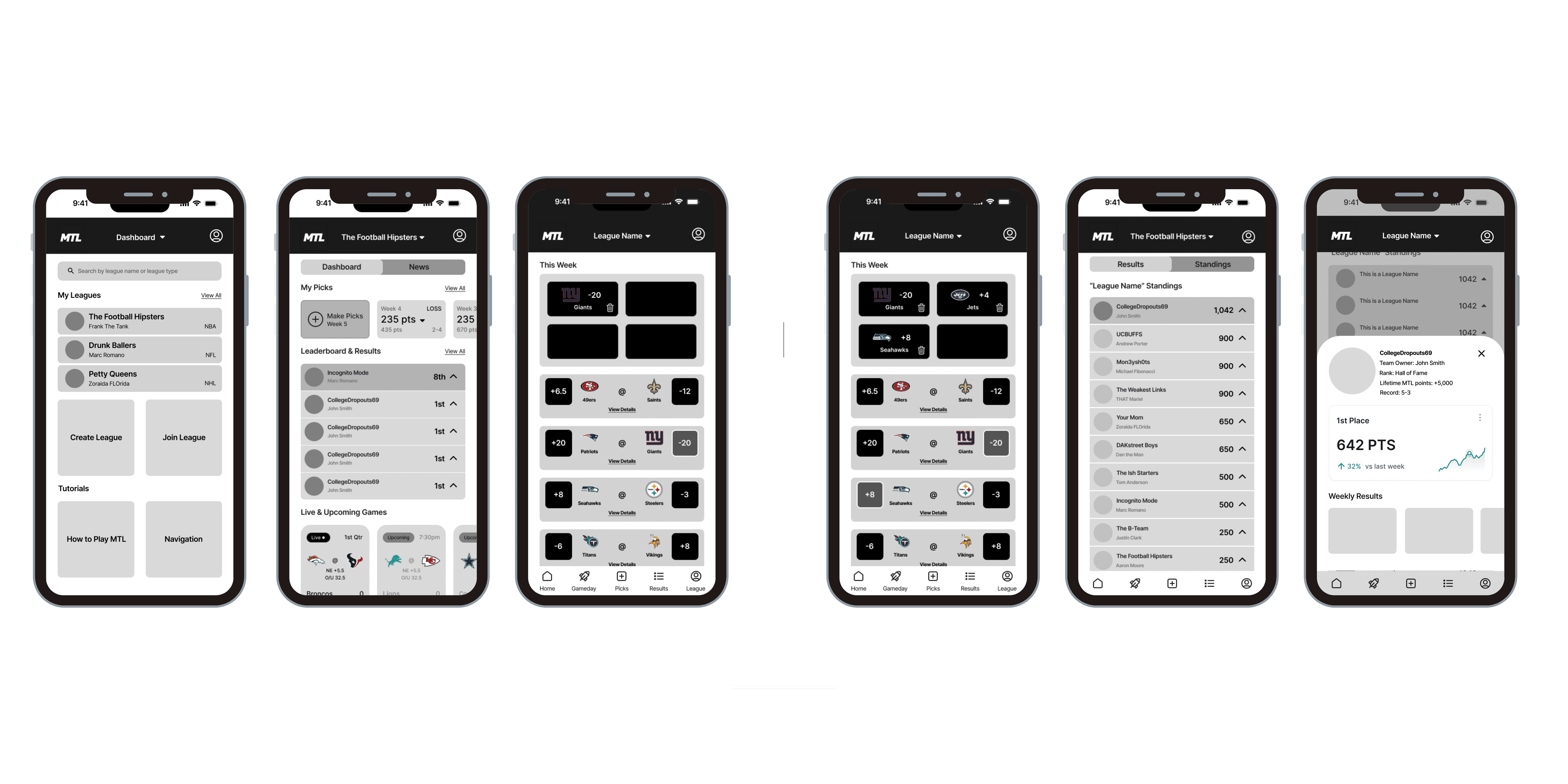
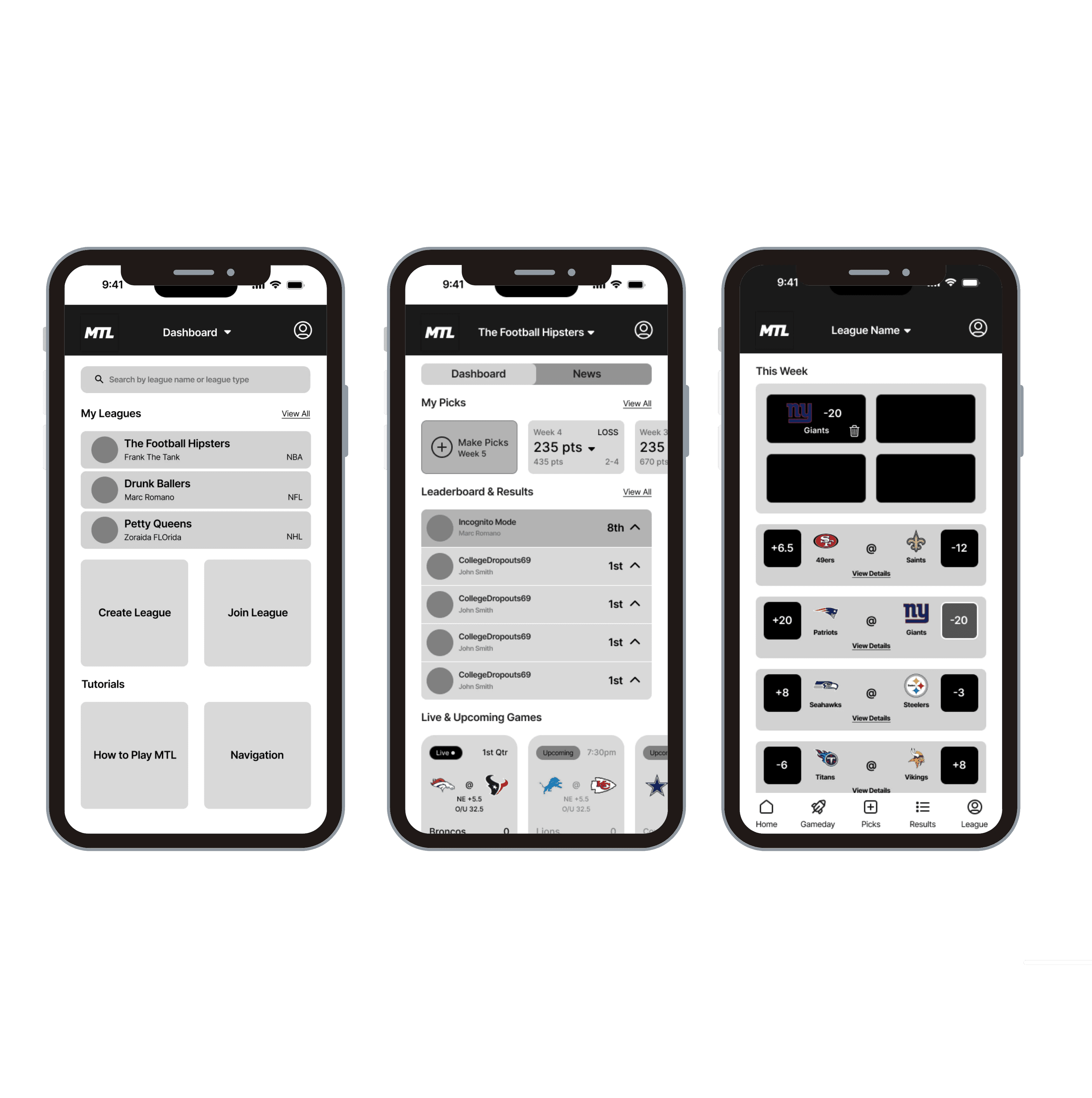
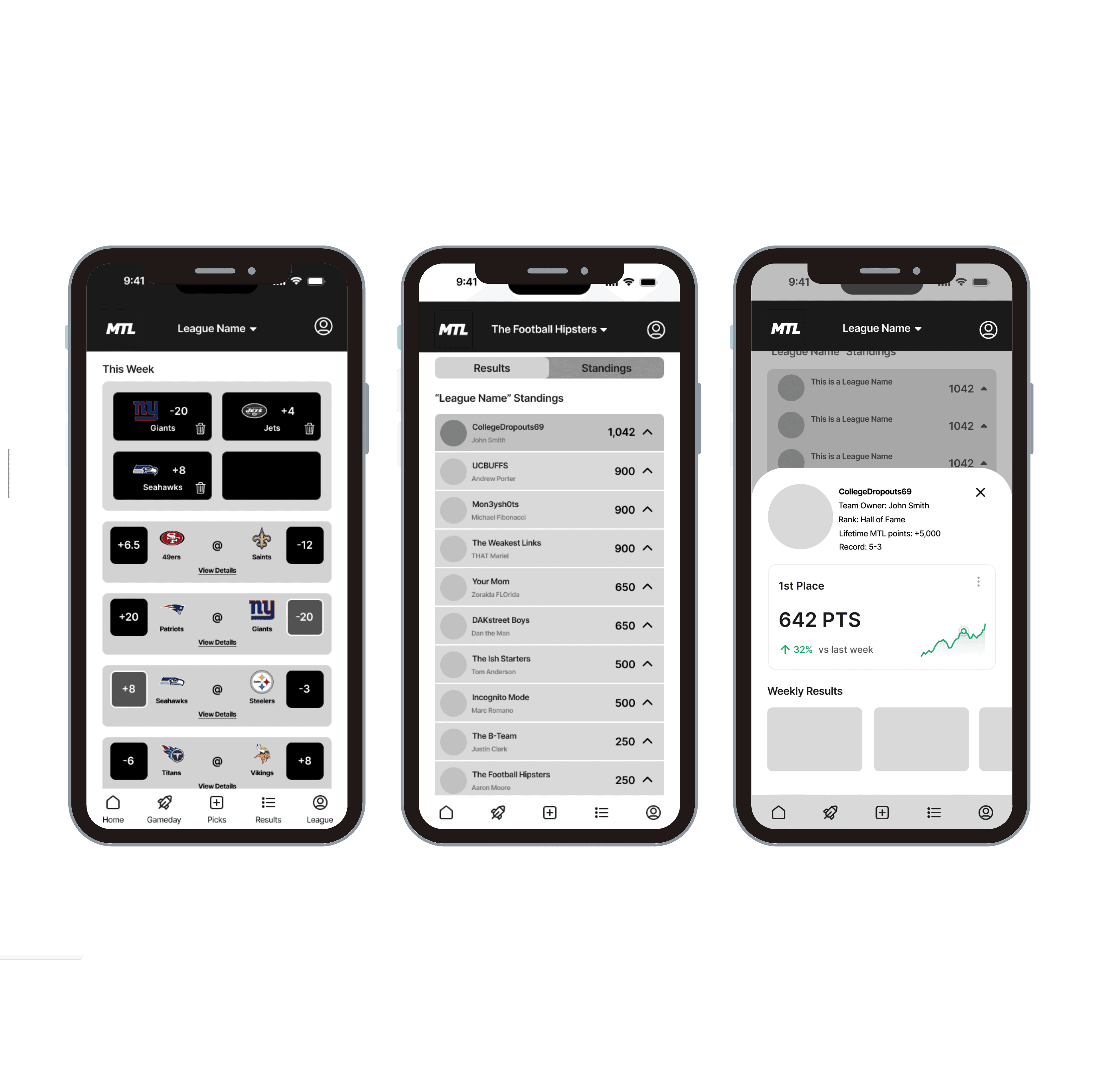
As we work throgh the design phase, our collective brainstorming efforts in sketching paid dividends in the form of mid-fidelity prototypes. These prototypes were a direct evolution of our collaborative sketching sessions, embodying the best ideas our team had generated.
As we work throgh the design phase, our collective brainstorming efforts in sketching paid dividends in the form of mid-fidelity prototypes. These prototypes were a direct evolution of our collaborative sketching sessions, embodying the best ideas our team had generated.
As we work throgh the design phase, our collective brainstorming efforts in sketching paid dividends in the form of mid-fidelity prototypes. These prototypes were a direct evolution of our collaborative sketching sessions, embodying the best ideas our team had generated.
Pre-Season: Usability Testing
Pre-Season: Usability Testing
Pre-Season: Usability Testing
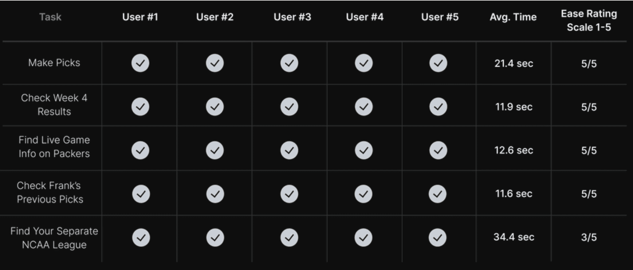
The usability tests for these prototypes exceeded our expectations. Users navigated through tasks with ease, offering praise for the new direction of the application. This success was incredibly rewarding, reaffirming the value of our collaborative approach and reminding me why I'm passionate about UX design.
The usability tests for these prototypes exceeded our expectations. Users navigated through tasks with ease, offering praise for the new direction of the application. This success was incredibly rewarding, reaffirming the value of our collaborative approach and reminding me why I'm passionate about UX design.
The usability tests for these prototypes exceeded our expectations. Users navigated through tasks with ease, offering praise for the new direction of the application. This success was incredibly rewarding, reaffirming the value of our collaborative approach and reminding me why I'm passionate about UX design.

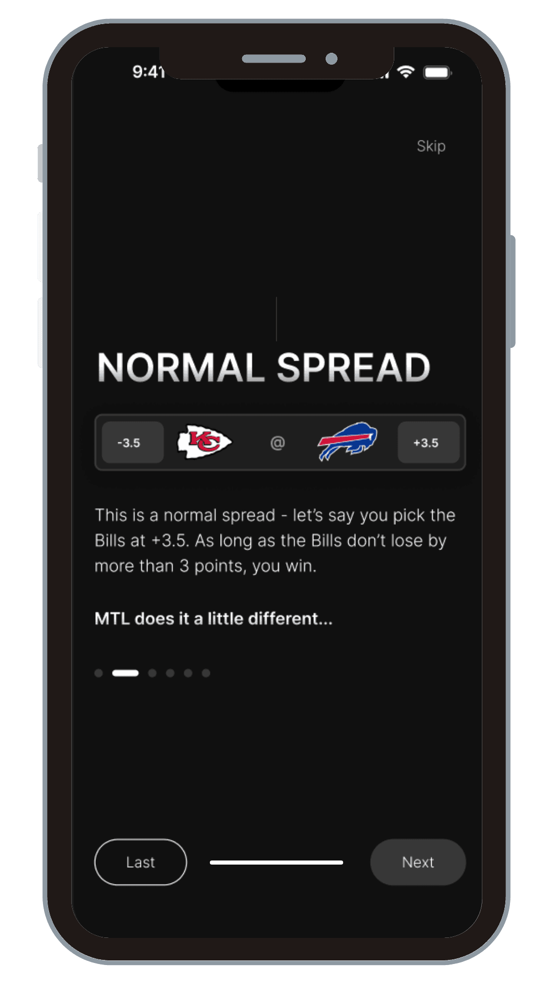
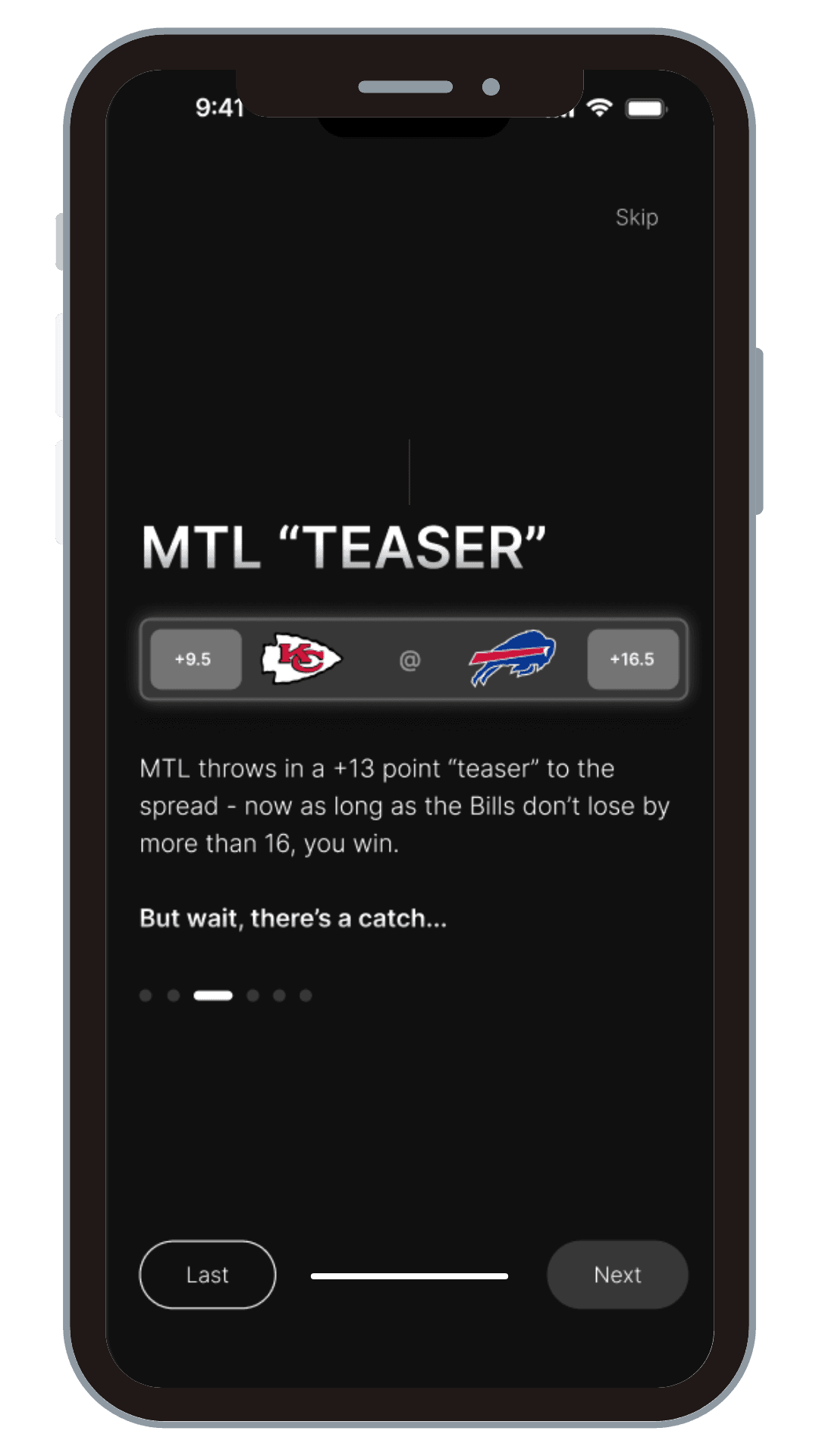
A standout achievement was our tutorial design. Despite its simple appearance, it represented countless hours of refinement and teamwork. Explaining MTL's unique gameplay had always been a challenge, even for seasoned users like myself. However, the outstanding results from our tutorial testing marked a significant victory for our team, proving that we had cracked the code on making MTL accessible to newcomers.
A standout achievement was our tutorial design. Despite its simple appearance, it represented countless hours of refinement and teamwork. Explaining MTL's unique gameplay had always been a challenge, even for seasoned users like myself. However, the outstanding results from our tutorial testing marked a significant victory for our team, proving that we had cracked the code on making MTL accessible to newcomers.
A standout achievement was our tutorial design. Despite its simple appearance, it represented countless hours of refinement and teamwork. Explaining MTL's unique gameplay had always been a challenge, even for seasoned users like myself. However, the outstanding results from our tutorial testing marked a significant victory for our team, proving that we had cracked the code on making MTL accessible to newcomers.
Averae Comprehension Time
Averae Comprehension Time
Averae Comprehension Time
1m 26s
1m 26s
1m 26s
User's experienced a 60% reduction in gameplay learnability.
User's experienced a 60% reduction in gameplay learnability.
User's experienced a 60% reduction in gameplay learnability.
Success Rate
Success Rate
Success Rate
100%
100%
100%
All usser's could explain the rules effectively without error a 60% increase.
All usser's could explain the rules effectively without error a 60% increase.
All usser's could explain the rules effectively without error a 60% increase.
Ease of Learnability
Ease of Learnability
Ease of Learnability
4.3/5
4.3/5
4.3/5
User's rated ease of learnability 39% higher.
User's rated ease of learnability 39% higher.
User's rated ease of learnability 39% higher.
The Final Drive: Hi-Fidelity Prototype
The Final Drive: Hi-Fidelity Prototype
The Final Drive: Hi-Fidelity Prototype
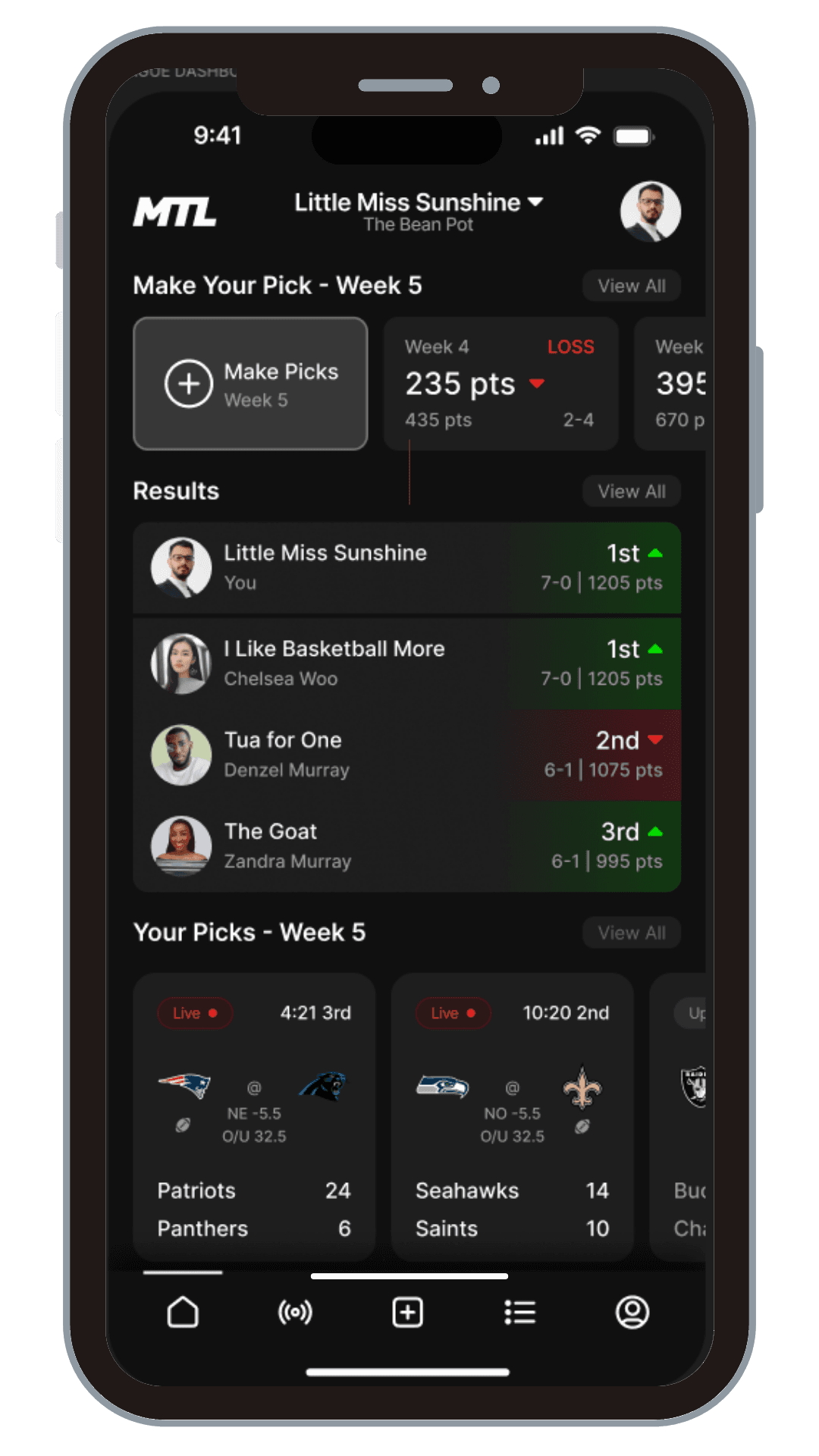
Building on the success of our mid-fidelity tests, we advanced to creating high-fidelity wireframes. This final design phase was the culmination of all our research insights and user feedback. Our game-changing plays included:
Building on the success of our mid-fidelity tests, we advanced to creating high-fidelity wireframes. This final design phase was the culmination of all our research insights and user feedback. Our game-changing plays included:
Building on the success of our mid-fidelity tests, we advanced to creating high-fidelity wireframes. This final design phase was the culmination of all our research insights and user feedback. Our game-changing plays included:
01.
01.
01.
Centralized League Dashboard: We consolidated main user actions onto a single, intuitive dashboard. Users could now make picks, view results, and check game day information all from one central hub.
Centralized League Dashboard: We consolidated main user actions onto a single, intuitive dashboard. Users could now make picks, view results, and check game day information all from one central hub.
Centralized League Dashboard: We consolidated main user actions onto a single, intuitive dashboard. Users could now make picks, view results, and check game day information all from one central hub.
02.
02.
02.
Enhanced League Member Insights: We added detailed league member profiles and history, giving users the context they craved about their competition and league evolution.
Enhanced League Member Insights: We added detailed league member profiles and history, giving users the context they craved about their competition and league evolution.
Enhanced League Member Insights: We added detailed league member profiles and history, giving users the context they craved about their competition and league evolution.
03.
03.
03.
Streamlined Information Architecture: We eliminated the need for multiple page navigations by making league information readily available to both commissioners and players.
Streamlined Information Architecture: We eliminated the need for multiple page navigations by making league information readily available to both commissioners and players.
Streamlined Information Architecture: We eliminated the need for multiple page navigations by making league information readily available to both commissioners and players.
04.
04.
04.
Empowered League Management: For commissioners, we developed a comprehensive management section within the League tab, centralizing all administration tasks.
Empowered League Management: For commissioners, we developed a comprehensive management section within the League tab, centralizing all administration tasks.
Empowered League Management: For commissioners, we developed a comprehensive management section within the League tab, centralizing all administration tasks.
05.
05.
05.
Mobile-First Design: Recognizing the high percentage of mobile users, we optimized the entire interface for on-the-go access.
Mobile-First Design: Recognizing the high percentage of mobile users, we optimized the entire interface for on-the-go access.
Mobile-First Design: Recognizing the high percentage of mobile users, we optimized the entire interface for on-the-go access.
Hi-Fidelity Prototype:
Hi-Fidelity Prototype:
Hi-Fidelity Prototype:
Building on the success of our mid-fidelity tests, we advanced to creating high-fidelity wireframes. This final design phase was the culmination of all our research insights and user feedback. Our game-changing plays included:
Building on the success of our mid-fidelity tests, we advanced to creating high-fidelity wireframes. This final design phase was the culmination of all our research insights and user feedback. Our game-changing plays included:
Building on the success of our mid-fidelity tests, we advanced to creating high-fidelity wireframes. This final design phase was the culmination of all our research insights and user feedback. Our game-changing plays included:
Take a walk through the fully functional prototype that represented our user centered design process below:
Take a walk through the fully functional prototype that represented our user centered design process below:
Take a walk through the fully functional prototype that represented our user centered design process below:
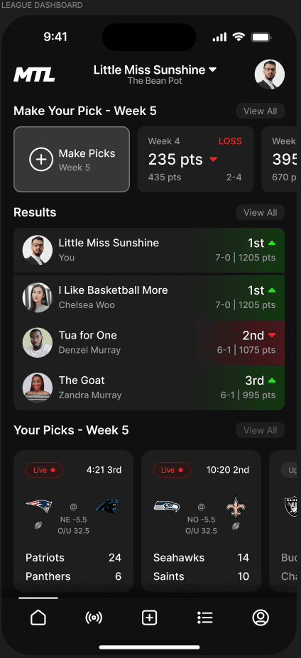
Dashboard
Dashboard
Dashboard
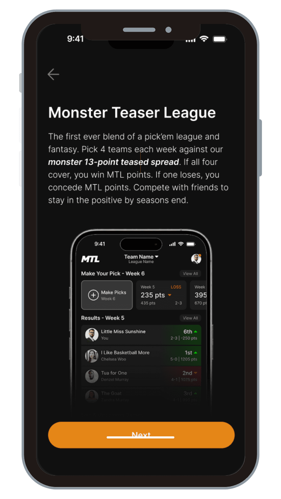
This became the command center of the MTL experience. Users could make picks, view results and standings, and access game day information - all from one intuitive landing page.
Centralized League Dashboard: We consolidated main user actions onto the league dashboard and main navigation, responding to user feedback for quicker access to core functions.Consolidated
Information Architecture: We streamlined the information structure both from the bottom navigation and main dashboard itself. Making league information readily available to both commissioners and players, eliminating the need to navigate through multiple pages.
Results: Users reported a 40% decrease in time spent navigating the app for core functions.
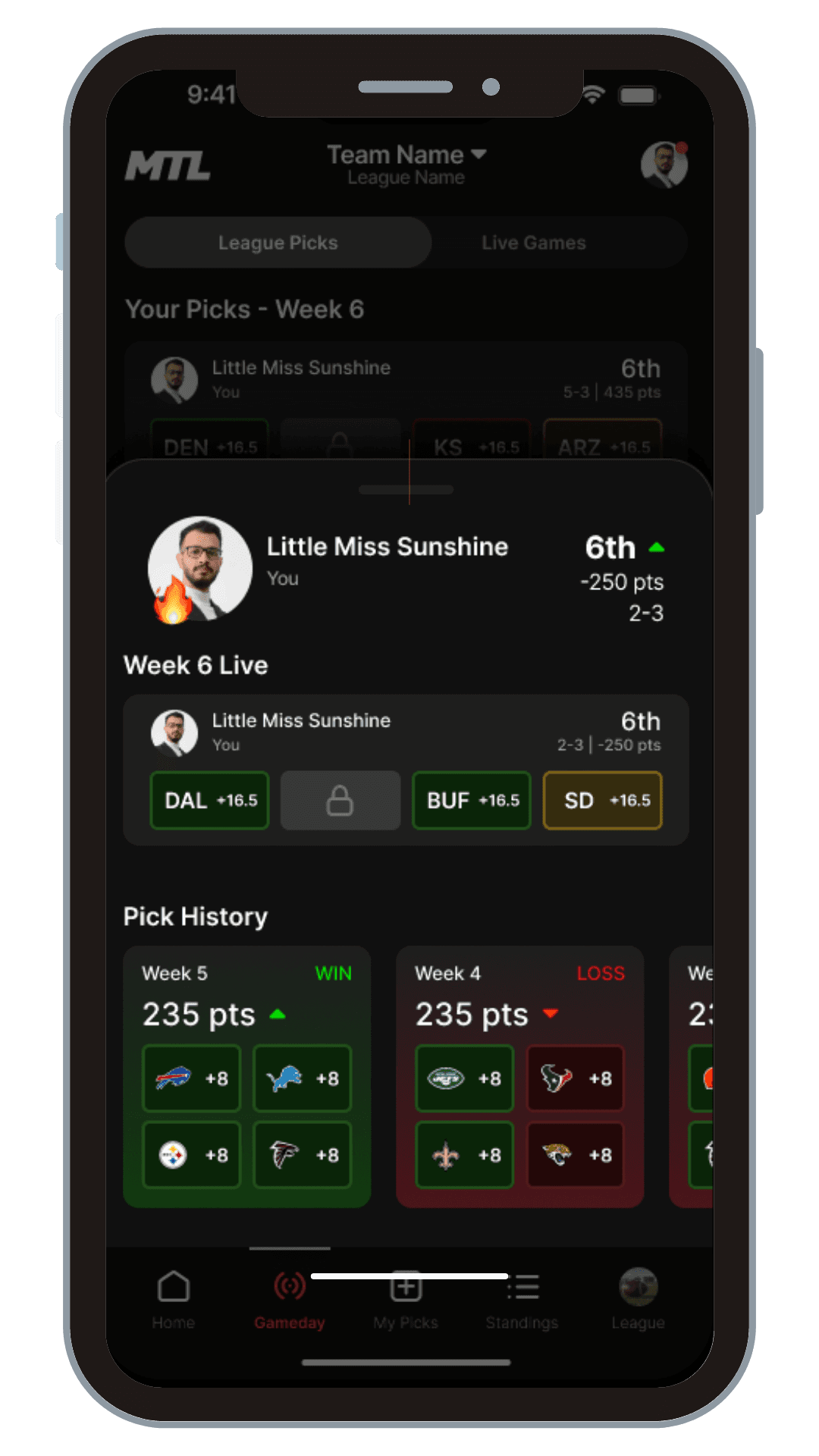
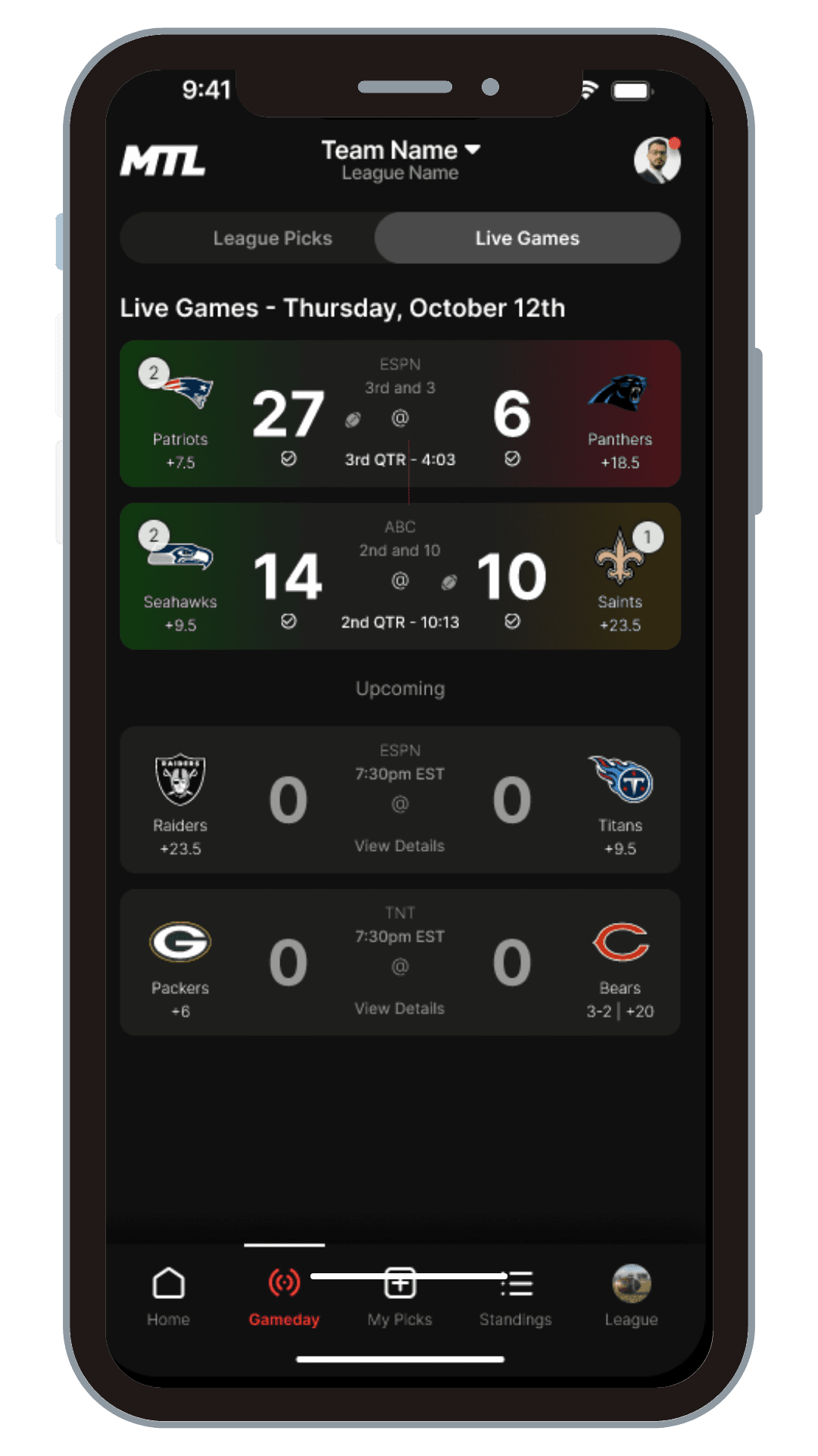
Gameday
Gameday
Gameday
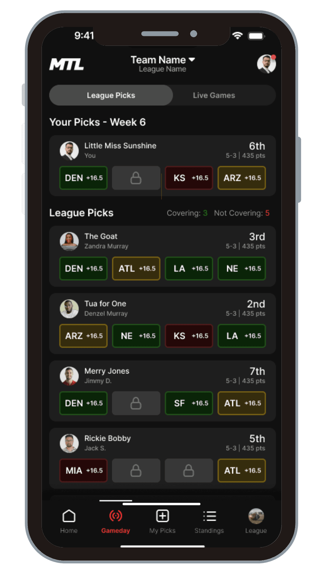
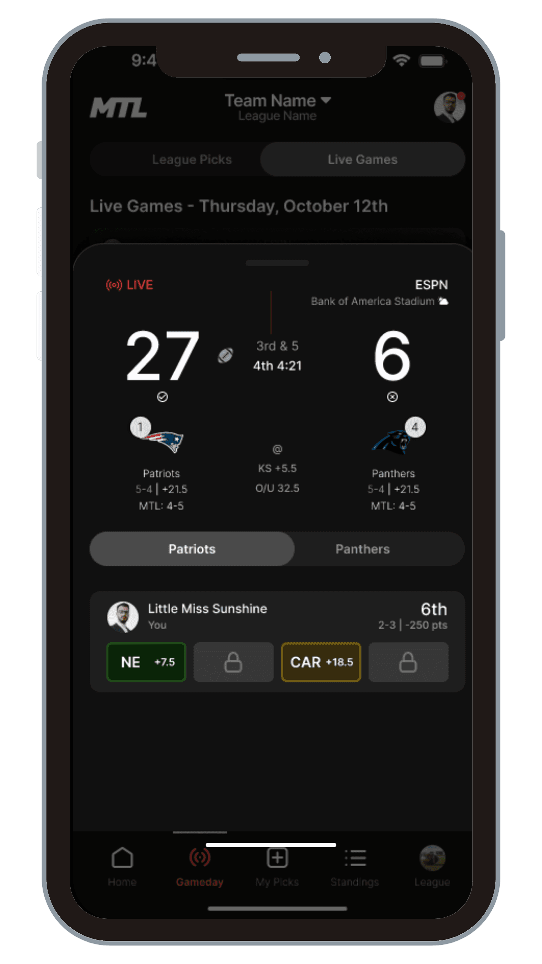
We transformed this into a dynamic, real-time experience. Users could now track their picks and their friends' performances live, with an intuitive color-coding system (green for covering, yellow for close, red for not covering).
Real Time Tracking: Implemented real-time tracking of picks with accesible performance indicators in addition to color coding.
Creating Community: Added ability to view friends' performances live by making user profiles clickable for detailed overview and history.
Creating Community: User engagement during live games increased by 65%.
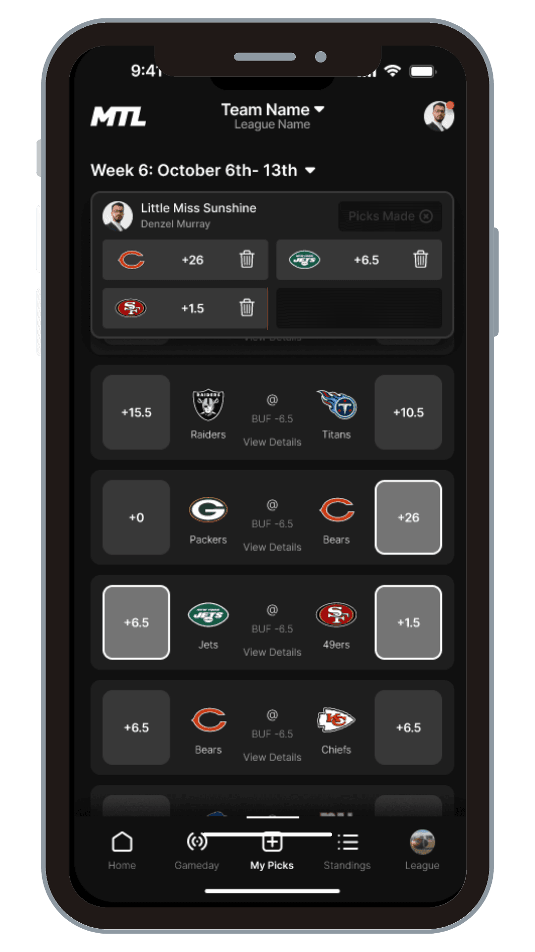
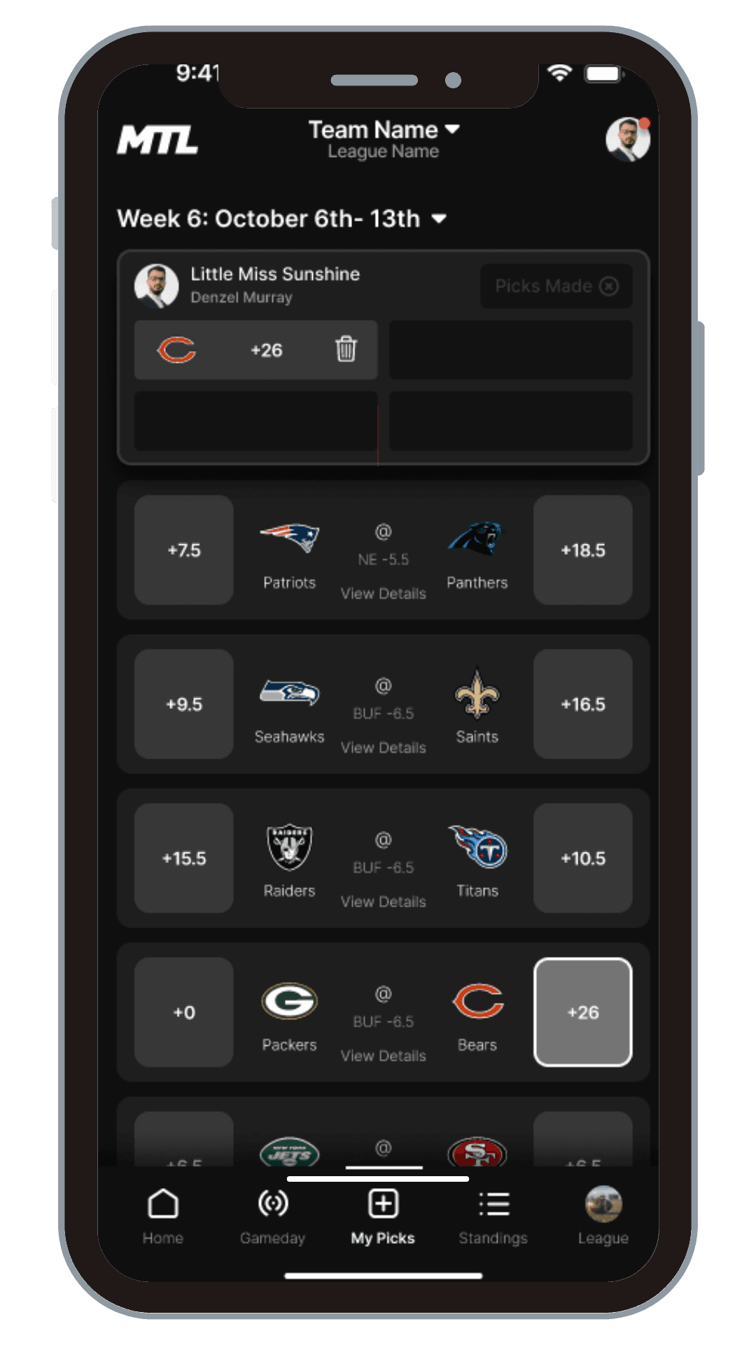
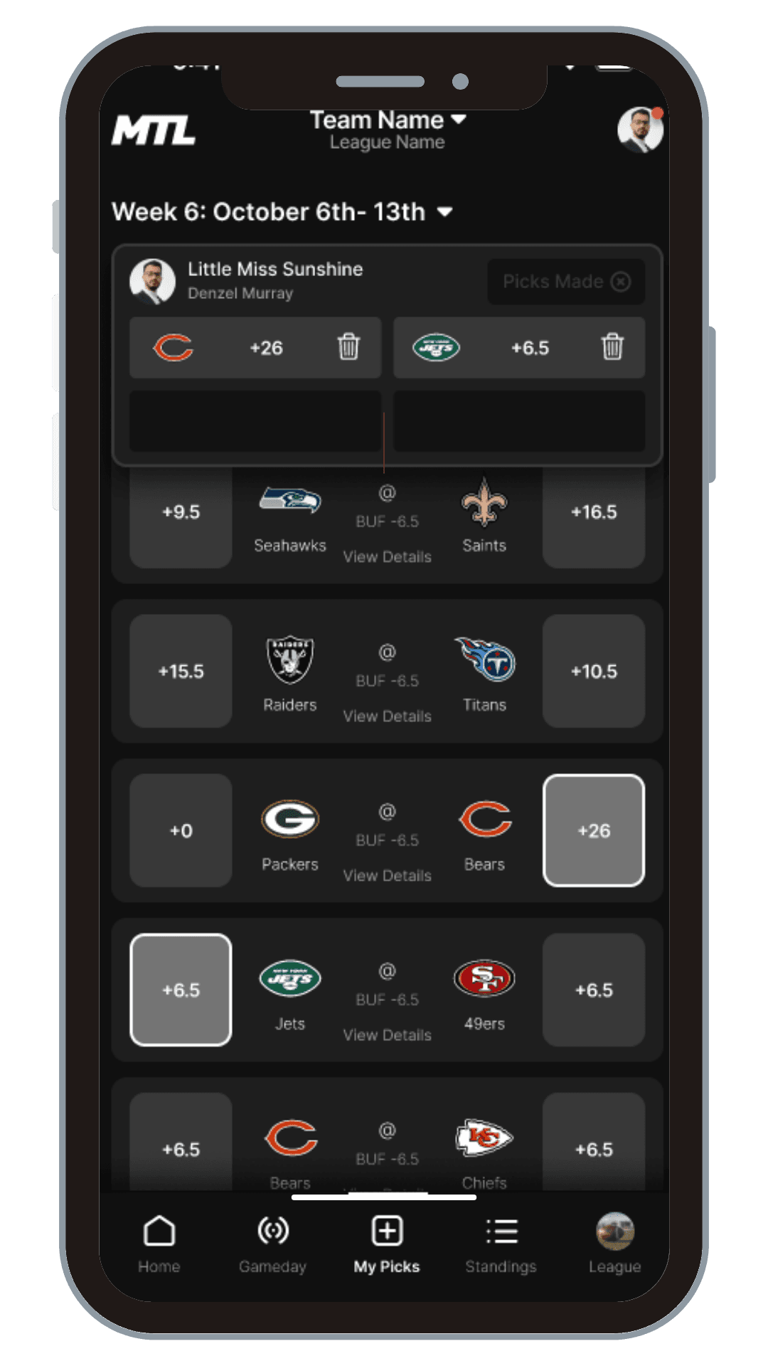
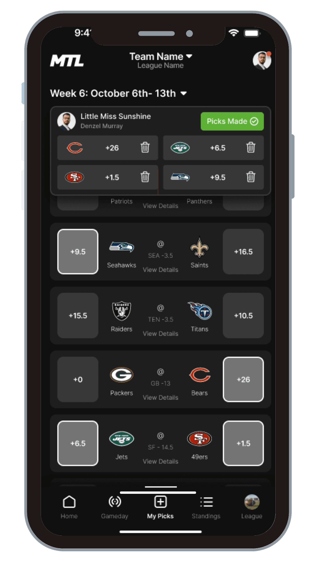
Make Picks
Make Picks
Make Picks
We streamlined this crucial function while adding the ability to dive deeper into matchup information, empowering users to make more informed decisions.
Intuitive Process: Streamlined the pick-making process making this key feature of the game accessbile immediately to users.
Meaningful Information: Added in-depth matchup information for informed decision-making.
Results: Time users spent navigating the application to make their picks reduced by 30%.
League Tab
League Tab
League Tab
This became a dual-purpose powerhouse. For players, it served as an information hub for league rules and player info. For commissioners, it transformed into an intuitive command center for league management.
For Players: Centralized access to league rules, MTL gameplay rules, and player information.
For Commissioners: Exclusive access to league management tools. Included features to adjust league rules, contact players, make picks for players, and retire players. Streamlined administrative tasks into one intuitive interface.
Results: Commissioner tasks were completed 35% faster, and player inquiries about league rules decreased by 60%.
Post-Game Analysis: Reflection and Lessons Learned
Post-Game Analysis: Reflection and Lessons Learned
Post-Game Analysis: Reflection and Lessons Learned
As UX Project Lead, my role extended beyond design decisions to coordinating a team of remote, diverse talents. I implemented daily stand-ups and project management tools to ensure clear communication and progress tracking, while facilitating collaborative workshops to bridge the gap between our UX designers' creative ideas and our developers' technical constraints. This approach fostered an environment where innovative solutions could emerge, blending creative vision with technical feasibility.
Managing client expectations was equally critical. I maintained regular communication with MTL stakeholders, providing transparent updates and incorporating feedback throughout the process. This open dialogue allowed us to pivot quickly when needed, ensuring our final product met both user needs and MTL's vision. By creating an environment that encouraged collaboration and user-centered design, we not only redesigned an app but built a stronger, more cohesive team ready for future challenges.
How I can help you?
UX Discovery & Direction
Starting from $1,500
Evaluate your current product and optimize its structure through expert UX analysis and strategic information architecture design.
Design & Validation
Starting from $2,400
Creating and validating user-centered designs through interactive prototyping and real-world usability testing with 5-7 users.

